- Select 2 words which best describes your character.
- Come up with 8 design concepts.
- Select 2 concepts which you like most and
- Produce and present your selected designs on A5 size papers.
This is what I have brainstormed and drawn in my sketch book during the lecture. Although we are encouraged to come up with one 'love' & 'hate' design, but after much considerations, I think I will have more 'love' stuffs which i want to share... The 2 'love' concept I chose is 'rainbow' & 'Lord of the Rings'. Rainbow is my favourite colour since young, and Lord of the Rings is my favourite movie/book!

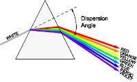
For the rainbow design, I find it hard to come up with a design that's creative, since by just using the rainbow color in the final piece, the concept can be easily captured. Though I did come up with the 4 designs, but I knew that only by using the concept of a 'real' rainbow in the sky, that will make my design more presentable...
As for the LotR design, I am quite excited about the ideas, since i really loved it... 2 things I that I feel can really represent the concept will be the 'Ring', as well as the LotR title font design, which becomes my 1st & 2nd design. Also, counting the no. of letters of my name (which is 9), the image of the fellowship immediately came to my mind. So i have the ideas of making each of my letters into a individual character of the fellowship, namely Aragorn, Gandalf, Legolas, Boromir, Gimli, & the 4 hobbits, Merry, Pippin, Frodo & Sam... (which is my 3rd design
I went back home to do some more online research on my ideas, managed to find some pictures that can help me to finalise the details of my rough...

So i further searched for each individual character of the fellowship, hoping to identify some key features to represent them.


But after much consideration of the difficulties & time constraints, I decided to drop the 'big' idea and go back to the font design. That's the 2 rough sketches I have done.


The comments I get during the tutorial presentation:
Rainbow
- design appealing
- the name didn't really make use of the concept, it's just a letter block being cut out
- possible solution will be to incorporate the letters with things like clouds, birds, etc...
Lord of the Rings
- may have to deal with copyright issue
- should have something for the general mass to know (i.e. the ring)
- suggest to mix & combine the thumbnail ideas into a new design
So, for my final design, I used Macromedia Freehand to draw the design. (using the techniques taught in the lab) I still don't have Adobe Photoshop, so I not sure how to do image stuff with just Freehand. Thus, my LotR design ended up very plain & boring, again, due to time constraints. But I think I shall further develop it along the way, when i manage to learn more techniques in the program.


But through this assignment, I have learnt more about the proper process of design, and the need to sketch out the rough ideas instead of just brainstorming inside the head. Well, I am still new with visual design. Just hope that I can slowly learn this sem... =p
2 comments:
hey there, i think the rainbow idea is nice (no wonder you suggested i use colours =p)
but the clouds have also become a motif, recurring too much for comfort? they appear at the end of the rainbow and as the letters forming your name - it may be read as you like clouds, and the rainbow serves to illustrate by providing the cheery colours to show how you like clouds?
pity the prism idea wasn't used, heh, reminds me of pink floyd's dark side of the moon cd cover =)
for LOTR, it's nice but your classmates have your interests at heart - it looks like a rip off! i think it's better to use something not so commercially related to LOTR, maybe you can use the ring as part of your name and something else to dilute it. the purpose is to detach your whole name from the ring =)
Thanks for the comment!
I'll try to improve it (if i can afford the time...) =p
Post a Comment