Monday, April 9, 2007

Assignment 7: Storybook Design (Group Project)

Exercise:
  • Design and prepare a story book for children (Ages 6 to 9)
  • Number of pages - around 12
  • Do not use more than 900 words for copy (story)
  • Prepare design document
  • Book Size: 7 X 8.5 inches

This is the last assignment of this course, which is going to last for 3 weeks. I teamed up with Natasha again for this group assignment. Natasha managed to find a good existing children story book by Max Lucado entitled "You are Special". It is a very meaningful story so we decided to adapted the concept and came out with our own story.

We brainstormed some ideas and eventually agreed on using the concept of robots in our story. So our main character Ron the little robot is borned!

We initially wanted to make our book layout to be one page of text on the left, and one page of pictures on the right, keeping it consistent and simple for children to read. But after getting some feedback from the lecturer, we decided to change the idea into a mixture of pictures and text on each page while following a grid layout.

Also, with much consideration, we decided to make our storybook into a colouring book as well. So, only the main character Ron will be coloured throughout the book. (Due to some technical difficulties, I can't upload the images of the final design...)

Sunday, March 18, 2007

Assignment 6: Gestalt Principles - Design Analysis

Exercise:
  • group project (group of 2)
  • select one good and one bad (in your opinion) design (e.g. poster, magazine advertisement or information brochure)
  • analyse both designs and build a case to support your opinion.
  • analysis should be based on visual principles (visual forms, visual harmony, colour and gestalt principles)
  • Submission: 6 minutes presentation in class

This assignment should be considered the easiest among all our assignments for this module, as we do not need to come out with any new designs but just to find existing designs and comment about it based on the visual principles that we learnt. Perhaps the only challengin part is finding the bad design, since if the design is really bad in the 1st place, it shouldn't be published at all! Lol...

So, I teamed up with my partner Natasha for this assignment. I volunteered to look for the good design while she handled the bad one. We agreed to look for movie posters for both so that it's easier to compare the difference.

It wasn't long when I decided to use one of the movie posters of my all-time favourite movie - Lord of the Rings! It's the poster for the 2nd part of the trilogy: The Two Tower.

http://www.impawards.com/2002/lord_of_the_rings_the_two_towers_ver5.html

Basically, there are 3 main principles that the poster used in the design.

Figure & Ground

  • There is a clear contrast between the foreground image and background image. (The man in the most front layer, the 2 ladies behind him, and the background image at the furthest.)
Similar Colour Scheme
  • The whole poster used the greyish blue as the main color scheme, hence every element on the poster seems to be part of it, and not seperate items placed together.
  • The bright golden yellow color used for the movie title appeared very outstanding as a result of such clear contrast compared with the whole poster.
Symmetry
  • Personally, I feel that the main reason why I like this poster and find it good is its usage of symmetry.
  • Clearly, we can see 3 layers of symmetry in the poster.
  • Firstly, is the man at the centre holding the sword, dividing himself to 2 equal parts which form the symmetry.
  • Secondly, is the 2 other ladies which are placed at the same height and depth on both the left & right of the man.
  • Lastly, is the background structure of the pillar design, which is symmetrical.
  • It's also interesting that the 3 characters in the poster actually tells the viewer a rough story of them, i.e. a typical love triangle between a man and two women.

As for the bad design, we chose the below one. (I should not comment much on it)

http://www.impawards.com/1998/night_at_the_roxbury.html

Can you identify what's bad in this poster? =p

One thing I learnt from this exercise and the visual principles is that it's important to understand that each of the principles are not mutually exclusive, meaning they are all inter-related. One cannot just simply focus his design on one principle without considering the other. And something about movie poster in particular, the design must enable the view to have a rough feel of what the movie is about.


    Sunday, March 11, 2007

    Assignment 5: Love - Inspirational Poster

    Exercise:
    1. Pick your favorite quote related to the theme (love, romance, tenderness, etc)
    2. Design a inspirational poster (sponsored by cupid greeting card Pte ltd)
    3. Poster should convey the theme primarily through colours with minimal use of photographs and other visual elements.
    4. Take Colour print out. Size of Artwork: A4 or smaller.
    This assignment is quite easy to think in terms of ideas to represent love. And it just took me a few seconds to decide to use God's love for all men through His son Jesus, since that's the greatest love anyone can ever receive. I guess the challenging part is finding the correct colours and design to represent this theme of love.

    As usual, I wanted my design to be always clean & simple. So I tried using simple shapes and colors to symbolise the theme. Two main shapes need to be present are a cross and a heart.


    So below is the one I came out with:


    (Front Cover)

    (Inside)

    I chose the color sky blue as the background color for the cover because it represents heaven & divinity, which give people a peaceful feel to the card. And for the heart, needless to say, the color pink is used, since it's the universal representation of love. Lastly, the white cross symbolise purity and truth, and the Christianity belief of Jesus crucifixion on the cross.

    The feedback I got during the tutorial is that the position of the cross makes the whole design unbalanced & distracting. But my initial intention of puting at such position is to create a dual effect, one being the symbol of cross, second to imitate the look of a gift with wrapping ribbons if view from far. I will see if I can solve this issue again...

    This exercise makes me understand the importance of catchy color combination in a greeting card, especially for smaller ones. Since people won't notice the texts unless they took a closer look at it, the general color tone and mood must to set right so that people will roughly know if that's the kind of card they are looking for. And to stand out from the other cards of same theme is indeed challenging.

    Now i have a better sense of the meaning & representation of colors. =)

    Sunday, March 4, 2007

    Assignment 4: Save this/that - Poster Design

    Exercise:

    1. Pick a topic related to the theme (e.g.. save trees, stop coral destruction, stop pollution, save singlish, etc.)
    2. Write a copy (text which goes on poster) of not more than 150 words
    3. Design the poster such that it coveys the meaning through layout (placement of visual elements and their interaction- photos, text, graphics elements etc)
    4. Take Colour print out. Size of Artwork: A3.

    For this exercise, I thought of doing on the topic of "Stop Piracy". Due to the difficulties in making real photos & effect for the poster design, I settled with just using simple drawing to create another kind of 'signboard' style of poster.

    (Due to the issue of piracy, I yet to have the Adobe Photoshop software in my laptop, so can only use FreeHand & Fireworks... or using the computers in school...)

    Lastly, encourage everyone to support Original! (Or at least, prevent piracy if it's within your control... Though it's really tempting, but that's the right thing to do...)

    Wednesday, February 21, 2007

    Assignment 3: U C what I C

    Telling a story with not more than 10 pictures...

    Since this exercise falls on the Valentine's Week, I chose to come up with a story about Valentine... Special thanks to my friends who have helped in being my 'models' for this story, namely Yizhong, Weiling & Guoxiong... =p

    Here's the story... (Since the pictures should narrate the story themselves, I shall not add in any caption... See if you can understand... It's pretty simple & straightforward... )

    1


    2

    3

    4

    5

    6

    7


    8

    9

    10

    Get the story? =)

    Feel free to comments!
    (Btw, all the pictures are taken using the camera function of Nokia N70...)

    After doing this exercise, I now understand the difficulties of representing things when they are in static form, i.e. photos. Unlike video, it's very hard to portray actions as well as emotional flows in a story. Moreover, without the usage of words, you need to understand how to make a picture 'talk' by showing things which the viewer can relate and identify almost intuitively...

    This exercise definitely increases my interest & respect for photography.. =)

    Saturday, February 10, 2007

    Assignment 2: Making Images Talk

    Exercise:
    • Select an object or activity or location (telephone, running, bus stop, car, cooking etc). Try not to select an existing subject (eg. Toilet or well known sports symbols)
    • Create a representative image of the object (you may choose either iconic or indexic representation)
    • Distill the image through process of abstraction. (atleast 5 levels of abstraction from realistic to abstract) Indicate at what point in the abstraction process the object looses its specific identity and communicates generic meaning. Select that image and develop it into a symbol.
    • Print level of abstraction on A3 size paper and final symbol on A4 paper
    This assignment is a rather hard one for me, since almost every common thing that I can think of while brainstorming already has some kind of symbol existing... I even try to 'hunt' for any possible item during my journey home from school... Vehicles, cats, trees, lampposts, rubbish dump, bus-stop stand, fire extinguisher, shirt, the list goes forever...

    In the end, I decided to just use my guitar at home, since that's something I like and the shape of the guitar should make it an easily-identified symbol...

    So I took a photo of my guitar and import it to Freehand...

    And after tracing the shape & every possible details of the guitar out, I started taking out parts of it to make it simpler, until it finally left with just the outline shape...


    As a result, I picked the 2nd last design as the representation of my guitar since I felt that the last one already lost its specificity..

    During my presentation during the tutorial, the comments were generally ok... I also realised that I can actually have one more last abstraction design by taking away the circle inside, that'll make it even more generic... I may edit my final image alittle based on the feedbacks I got in class...

    But I have learnt something in the process of doing this assignment. (other than being more observant to my environment.. lol...) Indeed, the creation of a symbol is much easier & smoother if we start from an image, and systematically removing the details until it becomes too abstract... And it's interesting to see that a simple shape can actually represent many things, depending on the context where you are looking... And personally, I am quite amazed that I can actually draw such a proper-looking guitar myself... =p

    Saturday, February 3, 2007

    Assignment 1: Me Myself and I

    Exercise:

    - Select 2 words which best describes your character.
    - Come up with 8 design concepts.
    - Select 2 concepts which you like most and
    - Produce and present your selected designs on A5 size papers.

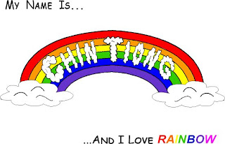
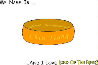
    This is what I have brainstormed and drawn in my sketch book during the lecture. Although we are encouraged to come up with one 'love' & 'hate' design, but after much considerations, I think I will have more 'love' stuffs which i want to share... The 2 'love' concept I chose is 'rainbow' & 'Lord of the Rings'. Rainbow is my favourite colour since young, and Lord of the Rings is my favourite movie/book!


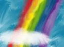
    For the rainbow design, I find it hard to come up with a design that's creative, since by just using the rainbow color in the final piece, the concept can be easily captured. Though I did come up with the 4 designs, but I knew that only by using the concept of a 'real' rainbow in the sky, that will make my design more presentable...

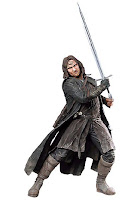
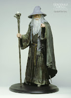
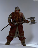
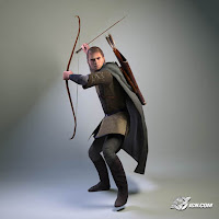
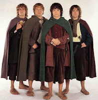
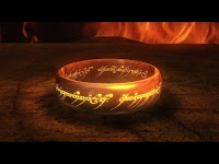
    As for the LotR design, I am quite excited about the ideas, since i really loved it... 2 things I that I feel can really represent the concept will be the 'Ring', as well as the LotR title font design, which becomes my 1st & 2nd design. Also, counting the no. of letters of my name (which is 9), the image of the fellowship immediately came to my mind. So i have the ideas of making each of my letters into a individual character of the fellowship, namely Aragorn, Gandalf, Legolas, Boromir, Gimli, & the 4 hobbits, Merry, Pippin, Frodo & Sam... (which is my 3rd design

    I went back home to do some more online research on my ideas, managed to find some pictures that can help me to finalise the details of my rough...


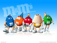
    For LotR, I thought it'll be very interesting if i can combine the ideas of M&M characters into the fellowship.


    So i further searched for each individual character of the fellowship, hoping to identify some key features to represent them.


    But after much consideration of the difficulties & time constraints, I decided to drop the 'big' idea and go back to the font design. That's the 2 rough sketches I have done.


    The comments I get during the tutorial presentation:

    Rainbow
    - design appealing
    - the name didn't really make use of the concept, it's just a letter block being cut out
    - possible solution will be to incorporate the letters with things like clouds, birds, etc...

    Lord of the Rings
    - may have to deal with copyright issue
    - should have something for the general mass to know (i.e. the ring)
    - suggest to mix & combine the thumbnail ideas into a new design

    So, for my final design, I used Macromedia Freehand to draw the design. (using the techniques taught in the lab) I still don't have Adobe Photoshop, so I not sure how to do image stuff with just Freehand. Thus, my LotR design ended up very plain & boring, again, due to time constraints. But I think I shall further develop it along the way, when i manage to learn more techniques in the program.


    But through this assignment, I have learnt more about the proper process of design, and the need to sketch out the rough ideas instead of just brainstorming inside the head. Well, I am still new with visual design. Just hope that I can slowly learn this sem... =p